Overview of IL-VIS
IL-VIS (Fig. 1) incrementally learns a high-dimensional trajectory (T^H) representing the progression of electrophysiological properties of an organoid over n sampling timepoints and visualizes it in 2D.
The (m(=9)) signals corresponding to the m electrodes in the MEA at each sampling timepoint i, where (1le i le n), are divided into segments of 4 s each. Each segment, denoted as (t^{i,j}) for the jth segment at the ith sampling timepoint, undergoes preprocessing using fast Fourier transformation (FFT)8 (see “Methods”). The collection of pre-processed (t^{i,j}) segments (forall j) forms the ith data increment, represented as (I_i) (illustrated in Fig. 1A). (I_i) is then reduced to 2D using the incrementally trained dimensionality reduction model based on SONG (Fig. 1B).
The model is trained for n sessions, once for each sampling timepoint. At session i, (I_i) is combined with the existing data ((bigcup _{k=1}^{i-1}I_k)), and the combined dataset (D_i = bigcup _{k=1}^{i}I_k) is used to train the existing model parameters (theta _{i-1}) to produce updated parameters (theta _{i}). (theta _{i}) is then used to generate a 2D visualization (V_i) that visualizes all the increments from (I_1) to (I_i) (Fig. 1C). The median of each (I_i) in (V_i) is traced from 1 to i in order to obtain (T^L) that visualizes the progression of the organoid’s electrophysiological properties over time. If n is sufficiently high, we would expect the consecutive and continuous data increments from an organoid to form a gradual progression and appear seamlessly connected, generating a continuous visualization. In the absence of such a continuous stream of data, a good visualization method should identify the trajectory progression even using discrete increments.
When visualizing the electrophysiological progression of a single organoid, the direction of the trajectory cannot be compared to another independently visualized organoid. Therefore, we extend IL-VIS to jointly model multiple organoids, allowing us to examine the directions of trajectories compared to each other and identify (dis)similarities in the electrophysiological progression of the corresponding organoids (see Fig. 6A–D, explained later).
In subsequent sections, we report two sets of results using (1) simulated data and (2) experimental MEA data obtained from cortical organoids.
Simulated data
Several studies have observed a gradual and non-linear increase in the electrical activity of brain organoids as they mature, characterized by parameters such as spike frequency, bursts, and synchrony9,10. This increase in activity is indicative of the development of more complex and mature synaptic connections among neurons and stronger electrical transmission within the organoids11. We verify IL-VIS’s ability to visualize this gradual but non-linear progression of electrophysiological properties as captured in high-dimensional data over time, in a 2D representation. However, it is possible that the actual progression of the electrophysiological properties may not show a gradual progression. This could be due to various factors such as developmental pathology, the influence of a disease, or administered therapeutic stimuli. After confirming that IL-VIS can accurately capture the expected gradual increase trend in healthy organoids, we can use IL-VIS to identify deviations from these trends resulting from the factors described above. Next, we validate IL-VIS’s capability to capture the (dis)similarities between multiple progression trajectories. This feature allows for visualization of the effect of different treatments on the electrophysiological progression of multiple organoids relative to each other.
We generate simulated data for which the corresponding high-dimensional trajectory (T^H) of the visualized trajectory (T^L) is known. Specifically, we formulate a set of non-linear high-dimensional trajectories {(T^H_r) where (rvarepsilon {1,…,4})} that gradually progress with time. The details related to the formation of (I_i), (1 le ile n) in each (T^H_r) can be found in “Methods”.
IL-VIS generates evolving visualizations capturing the underlying trends
Figure 2 shows the visualizations obtained using PCA and UMAP in place of SONG in IL-VIS in which PCA fails to capture the non-linearity present in data, while UMAP fails to generate evolving visualizations across the sessions. Additional experiments with Independent Component Analysis (ICA), Multi-Dimensional Scaling (MDS), and t-distributed Stochastic Nonlinear Embedding (t-SNE) are provided in the supplementary Fig. 2. These experiments demonstrate that they either fail to preserve the non-linearity, generate evolving visualizations (by preserving the orientation of the trajectories), or both. In contrast, by using SONG, as shown in Figs. 3 and 4, visualizations successfully capture the gradually increasing trend and the non-linearity of the high-dimensional trajectories (see Supplementary Fig. 1 for pairwise Euclidean and geodesic distance heatmaps between the increments in (T^H_r) and (T^L_r)). Significantly, IL-VIS also generates evolving visualizations, preserving the relative structure between the increments or the orientation across incremental visualizations, confirming that IL-VIS could be used for gaining insights from ongoing experiments. This ability stems from two key factors. Firstly, SONG operates as a parametric method, and secondly, IL-VIS preserves and reuses these parameters throughout iterations. To elaborate further, we conducted an additional experiment in which we reset the parameters at the beginning of each session, intentionally excluding the carryover of parameter values from the previous session. The resulting visualizations are shown in Supplementary Fig. 3. Notably, across sessions, the orientation of the trajectories is not preserved when the parameters are not carried forward. While it is conceivable to manually reorient the trajectories of each visualization, this approach may be impractical for intricate trajectories, highlighting a limitation of this approach. This underscores the significance of parameter continuity in preserving the meaningful evolution of visual representations over time. Additionally, we verify the manifold preservation quality of the SONG embeddings in Supplementary Fig. 4, and the method’s capability to cater to an even higher dimensional space (up to 10,000) in Supplementary Fig. 5.
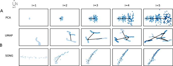
2D visualizations obtained by the pipeline when modeling (T^H_1) using (A) PCA, (B) UMAP and (C) SONG as the dimensionality reduction technique. (T^H_1) was defined on a pseudo-temporal parameter t (Eq. 2 in “Methods”). (phi _i(t)) is noise sampled from a Gaussian distribution (see “Methods”). (lambda ) is the percentage of noise added which is 20% for this experiment. Five increments of data points are formed ((n=5)) for each trajectory with no sampling gaps ((delta =0)) in between thus each increment contains 100 data points (see “Methods”). N corresponds to the number of data points used in each visualization. Each row contains the five visualizations generated at the five sessions where a new data increment is introduced at each session. At session i, all the increments thus far (i.e., (D_i = bigcup _{k=1}^{i}I_k)) are visualized. In visualizations with multiple increments, different increments are displayed in varying intensities of the same color. The stronger the intensity, the newer the increment. By tracing the medians of the subsequent increments chronologically, the emergence of (T^L_1) which is a 2D representation of (T^H_1) is observed. (A) PCA generated progressive visualizations but failed to preserve the non-linearity of (T^H_1). (B) UMAP preserved the non-linearity of (T^H_1) but failed to generate progressive visualizations over the sessions. (C) SONG preserved the non-linearity while generating progressive visualizations over the sessions.
IL-VIS is robust to noise and gaps in the data
To replicate random noise arising from biological and non-biological variations in real data, we add random Gaussian noise (20%) to each data increment in (T^H_1) (see “Methods”) and visualized in Fig. 3B–E. Despite the presence of this added noise, (T^L_1) successfully preserves the trend and non-linearity of (T^H_1) (Fig. 3B–E). However, as the noise level increases from 0 to 20%, there’s a corresponding decrease in the smoothness of (T^L_1) (Supplementary Fig. 6).
Although the processes underlying the biological experiments are continuous, the recorded features are discrete and the sampling time points may have considerable gaps between them. To replicate this, we introduce minor, medium, and major gaps between the increments in (T^H_1) (“Methods”) and visualize them in Fig. 3C-E. Despite such gaps, (T^L_1) captures a gradually increasing and non-linear path along which (T^H_1) progresses, suggesting that IL-VIS can handle datasets with considerable gaps and noise. When major gaps are introduced (where (delta =99)), five different clusters are visualized each corresponding to an increment instead of a continuous progression (Fig. 3E). This agreed with our expectations because IL-VIS had very limited information about continuity.
IL-VIS captures (dis)similarities between the trajectory progressions
The progression of electrophysiological properties of multiple organoids with different exposures may correspond to different trajectories in the high-dimensional space. Capturing the (dis)similarities between these trajectories and visualizing them as they evolve in a shared space would offer insights into the (dis)similarities in their electrophysiological progressions. For instance, a comparison between the electrophysiological maturation of organoids exposed and not exposed to a particular treatment would assist in understanding the treatment’s effect. We validate this capability of IL-VIS as below.
First, we jointly model and plot two independent randomly-generated non-linear trajectories ((T^H_1), and (T^H_2)) designed to originate at the same position while diverging at higher t values in Fig. 4A. As the new increments are added, the corresponding low dimensional trajectories (T^L_1) and (T^L_2) exhibit an increasing difference, highlighting their growing dissimilarity in later increments. Next, we extend the experiment by incorporating two secondary trajectories (T^H_3) and (T^H_4), along with the principal trajectories ((T^H_1) and (T^H_2)). (T^H_3) and (T^H_4) are created as combinations of (T^H_1) and (T^H_2), based on a similarity factor (alpha ) (“Methods”). Specifically, when (alpha = 1), (T^H_3) coincides with (T^H_1), and (T^H_4) coincides with (T^H_2). Conversely, when (alpha = 0), (T^H_3) coincides with (T^H_2), and (T^H_4) coincides with (T^H_1). For (0< alpha <1), (T^H_3) and (T^H_4) would be exhibiting intermediate characteristics between (T^H_1) and (T^H_2) along the trajectory continuum. The resulting 2D visualizations in Fig. 4B, C showcase these distinctive traits in the low-dimensional trajectories. Notably, when (alpha > 0.5), (T^L_3) is visualized closer to (T^L_1) than (T^L_2), and conversely, (T^L_4) is visualized closer to (T^L_2) than (T^L_1) (Supplementary Table 1). Subsequently, in Fig. 4C, as (alpha ) is incremented from 0.6 to 0.9, the visualizations of (T^L_3) and (T^L_4) gradually approach (T^L_1) and (T^L_2), respectively. Furthermore, within trajectory pairs such as (T^L_1) and (T^L_3) sharing similarities, i.e., when (alpha >0.5), the trajectories display increased separation in later increments compared to earlier increments, effectively capturing subtle but important dissimilarities. The experiments described above combined with these results, validate IL-VIS’s ability to generate evolving visualizations that preserve the high-dimensional trajectories’ similarity relationships.
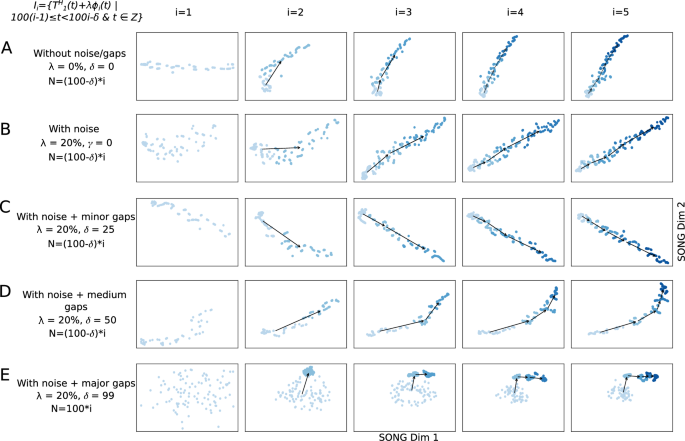
2D visualizations obtained by IL-VIS showed its capability in generating evolving visualizations capturing the gradually increasing and non-linear trends of a simulated 100-dimensional non-linear trajectory (T^H_1) (A) without noise/gaps, (B) with noise, (C) with noise and minor sampling gaps between increments, (D) with noise and medium sampling gaps between increments, and (E) with noise and major sampling gaps between increments. (T^H_1) was defined on a pseudo-temporal parameter t (Eq. 2). (phi _i(t)) is noise sampled from a Gaussian distribution (“Methods”). (lambda ) is the percentage of noise added: 0% for (A) and 20% for (B–E). For each experiment, five data increments were formed ((n=5)). The number of data points in each increment was determined based on (delta ) and was 100, 100, 75, 50, and 100 for experiments (A–E) respectively (see “Methods”). N corresponds to the number of data points used in each visualization. Each row contains the five visualizations generated at the five sessions where a new data increment is introduced to IL-VIS at each session. At session i, all the increments thus far (i.e., (D_i = bigcup _{k=1}^{i}I_k)) are visualized. In visualizations with multiple increments, different increments are displayed in varying intensities of the same color. The stronger the intensity, the newer the increment. By tracing the medians of the subsequent increments chronologically, the emergence of (T^L_1) which is a 2D representation of (T^H_1) is observed. Each consecutive visualization has maintained the structure across the previous visualization allowing us to relate between the visualizations. Furthermore, the progressiveness of the gradually increasing trajectory is captured by placing each new increment further away from the previous increments (Supplementary Fig. 1). IL-VIS shows robustness to noise (B) and minor to major gaps (C–E).
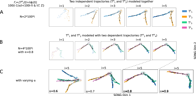
2D visualizations obtained by IL-VIS showed its capability in capturing the (dis)similarities in the progressions of (A) two trajectories: (T^H_1) and (T^H_2) and (B) four trajectories: (T^H_1) and (T^H_2) together with (T^H_3) and (T^H_4). (T^H_1), (T^H_2), (T^H_3), and (T^H_4) are 100-dimensional non-linear trajectories. (T^H_1) and (T^H_2) are independent (principle trajectories) whereas (T^H_3) and (T^H_4) are dependent (secondary trajectories) on (T^H_1) and (T^H_2). Specifically, (T^H_3) and (T^H_4) are created as compositions of (T^H_1) and (T^H_2) where a similarity factor ((alpha )) is used to determine how closely a secondary trajectory is to a principal trajectory (see Eq. 3). (phi _i(t)) is noise sampled from a Gaussian distribution and (lambda ) is the percentage of noise added which is 0% for this experiment (“Methods”). Five increments of data points are formed ((n=5)) for each trajectory with no sampling gaps ((delta =0)) in between thus each increment contains 100 data points (“Methods”). (I^r_i) is the ith data increment of (T^H_r). N corresponds to the total number of data points used in each visualization. Each experiment contains five visualizations generated at the five sessions. At each session i, the ith data increment of all trajectories that are modeled together is introduced to the pipeline. Each trajectory is shown in a different color. In visualizations with multiple increments, different increments are displayed in varying intensities of the same color. The stronger the intensity, the newer the increment. By tracing the medians of the subsequent increments chronologically, the emergence of (T^L_r) which is a 2D representation of (T^H_r) is observed. (A) (T^H_1) and (T^H_2) originate at the same position and diverge from each other as the increments are added which is consistent with the definition of the trajectories (B) when (alpha =0.8), (T^L_3) is visualized closer to (T^L_1) than to (T^L_2), and (T^L_4) is visualized closer to (T^L_2) than to (T^L_1) capturing the relative similarity between the principle and secondary trajectories (C) Visualizations generated at the last session ((i=5)) in four independent experiments with four different (alpha ) values. The (alpha ) was varied from 0.6 to 0.9 to observe the movement of (T^L_3) and (T^L_4) in reference to (T^L_1) and (T^L_2). (T^L_3) and (T^L_4) are visualized closer to (T^L_1) and (T^L_2) respectively as the (alpha ) is increased. Altogether, visualizations show IL-VIS’s capability in capturing the (dis)similarities in trajectory progressions.
Cortical organoids data
After validating IL-VIS on simulated data, IL-VIS is then applied to MEA data obtained from cortical organoids. MEA data has been previously used to assess alterations in neuronal excitability, e.g., mediated by neuroinflammation12. QUIN is an N-methyl-D-aspartate (NMDA) agonist generally synthesized and released during neuroinflammation. QUIN’s over-activation of NMDA receptors leads to neuronal excitotoxicity, thus, QUIN has been implicated in a range of diseases in which neurodegeneration is a key component, including AD, multiple sclerosis, and stroke13,14,15,16. QUIN has also recently been shown to reduce both neurite outgrowth and the number of synaptic spines in culture17. QUIN antibodies can provide neuroprotection7 by preventing QUIN binding to NMDA receptors or its uptake offering therapeutic potential for these diseases. In a previous study7, we showed that as little as 30 min of exposure to the same monoclonal anti-QUIN used in this study could protect oligodendrocyte cell line monolayers from cell death induced by QUIN. QUIN excitotoxicity and metabolism are very much associated with the aging process18,19, thus, the long-term effect of anti-QUIN to mitigate the effects of QUIN should be studied. Therefore, we analyze both the acute and chronic effects of exogenous anti-QUIN on both endogenous and exogenous QUIN using IL-VIS.
Our dataset (see “Methods”) contains MEA data from cortical organoids derived using four cell lines: two AD patients (AD1 and AD2) and two healthy controls (CN1 and CN2). Four organoids are derived from each cell line and exposed to one of the following four different treatments (1) untreated, (2) QUIN added, (3) anti-QUIN added, and (4) both QUIN and anti-QUIN added (QUIN + anti-QUIN). These 16 organoids from four cell lines are used to test the ability of anti-QUIN to sequester, thus reducing the deleterious effects of QUIN. QUIN is also produced by the organoids endogenously and released into the media, where it was quantified at 16–30 nM (Supplementary Fig. 8). The untreated organoids are used as controls for treatments (2), (3), and (4), and to establish the normal maturation profile reflected in the plots discussed later in Fig. 6. In treatment (2), organoids are exposed to exogenous QUIN at 100 nM, i.e., 3–5 times endogenous levels but lower than the circulating levels in blood20. This concentration is chosen to ensure physiological relevance to test the effect of increased QUIN on organoids. In treatment (3), organoids are exposed to anti-QUIN alone to determine anti-QUIN’s ability to sequester endogenous levels of QUIN. In treatment (4), organoids are exposed to both anti-QUIN and exogenous QUIN to assess anti-QUIN’s capability to sequester higher levels of QUIN. In treatments (3) and (4), anti-QUIN is added at 10 ({upmu {mathrm g/mL}}) concentration to reduce extracellular QUIN concentrations and prevent QUIN uptake and binding to NMDA receptors.
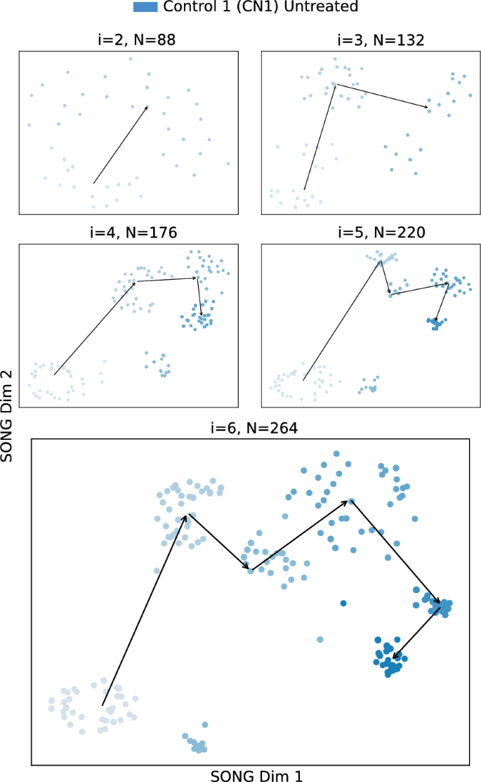
2D visualizations obtained by IL-VIS for the Untreated CN1 organoid when modeled independently. (I_1) to (I_6) are the six increments corresponding to the six different time points at which the recordings were taken (Table 2). At session i, all the increments thus far (i.e., (D_i = bigcup _{k=1}^{i}I_k)) are used for training the model. N corresponds to the number of data points used in each visualization where each point corresponds to a compact representation of a 4-s recording obtained from the 9 electrodes in the respective MEA plate. The 2D visualizations generated from the 2nd session ((i=2)) onwards are shown in the sub-figures. The color intensity represents the organoid’s maturity. In earlier increments, the color is lighter while in later increments the color is darker. The medians of the subsequent increments are traced chronologically to observe the trajectory followed by the organoid’s electrophysiological properties.
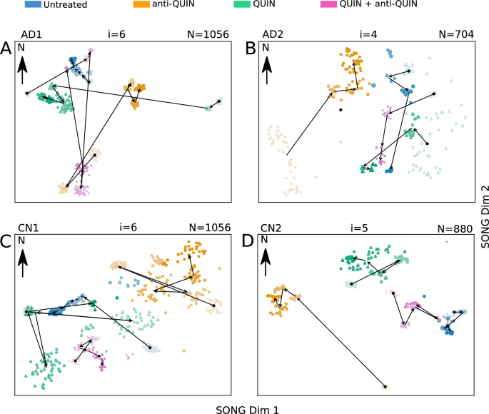
The 2D visualizations obtained by IL-VIS for each cell line at the end of the three months treatment period. The MEA data from the four organoids of the same cell line, treated with Untreated, QUIN, anti-QUIN, and QUIN+anti-QUIN, are modeled together. The data point representation is the same as Fig. 5. The visualizations show a unique progression in AD/CN organoids treated with anti-QUIN alone, compared to the progression of Untreated, QUIN-treated, or QUIN+anti-QUIN-treated organoids. (A) The anti-QUIN-treated trajectory originates at a considerable distance and moves in a different direction from the trajectories corresponding to the other three treatments. In contrast, both Untreated and QUIN+anti-QUIN treated trajectories initiate and converge in nearby locations to each other. Although the QUIN-treated trajectory initiates at a considerable distance, it converges to a point closer to the Untreated and QUIN+anti-QUIN-treated trajectories. (B) anti-QUIN-treated trajectory originates from the bottom left corner of the figure at a considerable distance from the three trajectories corresponding to the other three treatments which are originating at the right side of the figure. anti-QUIN treated trajectory propagates in the opposite direction (SW to NE and then towards N) than the other trajectories and converges in a distant location. The trajectories corresponding to the other three organoids converge closer to each other. (C) The anti-QUIN treated organoid is originating at a considerable distance from the other three organoids and moves in a different direction (top right). In contrast, the other three organoids are located more toward the bottom left corner of the figure. (D) The anti-QUIN treated organoid is originating at a considerable distance from all the other three organoids and moves towards the top left of the figure. In contrast, the other three organoids are located more toward the top right corner of the figure.
IL-VIS identifies the progression of the electrophysiological properties of an organoid
The progression of the electrophysiological properties of the untreated organoids, originally represented as high-dimensional trajectories in MEA data ((T^H_{CN1_{untreated}}), (T^H_{CN2_{untreated}}), (T^H_{AD1_{untreated}}), (T^H_{AD2_{untreated}})) are transformed into 2D trajectories ((T^L_{CN1_{untreated}}), (T^L_{CN2_{untreated}}), (T^L_{AD1_{untreated}}), (T^L_{AD2_{untreated}})) using IL-VIS (Fig. 5 and Supplementary Figs. 9–11). In contrast to a conventional spike count analysis (Supplementary Fig. 12), the generated visualizations offer a new perspective on the changes in an organoid’s electrophysiological state over time compared to its previous states. For instance, in Fig. 5, the 2nd, 3rd, and 4th increments of (T^L_{CN1_{untreated}}) appear to move away from the 1st. However, the 5th and 6th increments reverse the direction and move back towards the initial state, indicating that the organoid’s final electrophysiological states are becoming more similar to the initial state. These visualizations allow us to visualize the electrophysiological progression in individual organoids.
IL-VIS visualizes the progression of multiple organoids in the same visualization space
The spike frequency variation over the experimental period is depicted in Supplementary Fig. 12. However, it only shows the independent temporal variation and does not allow for a direct comparison of the effects between different treatments on organoids. We use IL-VIS to visualize the electrophysiological progression of the four organoids derived from the same cell line but exposed to different treatments in a shared space, enabling their comparison. Fig. 6 displays these visualizations obtained for each cell line at the end of a three-month treatment period.
The proximity between low-dimensional trajectories indicates the similarity in the electrophysiological progression of the corresponding organoids during their maturation. For instance, the increments in (T^L_{AD2_{untreated}}) and (T^L_{AD2_{QUIN+anti-QUIN}}) (Fig. 6B) are visualized closely, signifying the similar progressions of the untreated and QUIN+anti-QUIN-treated organoids derived from the AD2 cell line. We use an Euclidean distance-based metric (“Methods”) to quantitatively assess the proximity between trajectories, which provides a measure of the similarity in electrophysiological progression among the organoids.
The anti-QUIN-treated organoid trajectory deviates from the other three conditions in all four cell lines
Figure 6 illustrates that in each cell line, the trajectory corresponding to the anti-QUIN-treated organoid originates and progresses at a considerable distance from the trajectories corresponding to the other three conditions (Untreated, QUIN, and QUIN+anti-QUIN). Additionally, the trajectory of the anti-QUIN-treated organoid progresses in a distinctly different direction compared to the trajectory of the QUIN-treated organoid. For instance, in Fig. 6A, (T^L_{AD1_{QUIN}}) progresses from E to W while the (T^L_{AD1_{anti-QUIN}}) progresses from SW to NE. Similarly, in Fig. 6B, (T^L_{AD2_{QUIN}}) (NE to SW) and (T^L_{AD2_{anti-QUIN}}) (SW to NE) are progressed in parallel but in opposite directions. These findings suggest that anti-QUIN has a unique impact on electrophysiological activity compared to the other treatments.
Possible anti-QUIN sequestration of QUIN
The distances measured to trajectories of Untreated, QUIN, and QUIN+anti-QUIN-treated organoids by taking the trajectories of anti-QUIN-treated organoids as reference are ranked in increasing order in Table 1. For three of the four cell lines: AD1, AD2, and CN1, the treatments were ranked as follows: (1) untreated, (2) QUIN+anti-QUIN, and (3) QUIN. As expected, the trajectory of the QUIN-treated organoid is the least similar (ranked 3rd) to the trajectory of the anti-QUIN-treated organoid. The trajectory of the untreated is the closest (ranked 1st) while the trajectory of the QUIN+anti-QUIN-treated is the second closest (ranked 2nd). By attributing this closeness to the level of the effective concentration of QUIN bathing the organoids, we conjecture that the order of effective concentration of QUIN in organoids is increasing in the specific order: anti-QUIN-treated < Untreated < QUIN+anti-QUIN treated < QUIN-treated, suggesting that,
-
The concentration levels of anti-QUIN in anti-QUIN-treated are sufficient to sequester low levels of endogenous QUIN found in Untreated organoids.
-
Although not being able to fully neutralize the effect of QUIN, the concentration levels of anti-QUIN can sequester some exogenous QUIN found in QUIN + anti-QUIN-treated organoids.
For the remaining cell line (CN2), further investigation is needed to confirm the reason for the trajectory of the anti-QUIN-treated organoid being visualized closer to the trajectory of QUIN-treated than to the other two treatments and in particular to the Untreated organoid. One possible explanation for this would be that the endogenous QUIN in the Untreated CN2 is much higher after nine months than in the other three cell lines (Supplementary Fig. 8). However, for CN2, the placement of the trajectories of Untreated, QUIN-treated, and QUIN+anti-QUIN-treated organoids in Fig. 6 is consistent with the other three cell lines, i.e., the trajectory of QUIN-treated is closer to the trajectory of the QUIN+anti-QUIN-treated than to the trajectory of the Untreated organoid.
- SEO Powered Content & PR Distribution. Get Amplified Today.
- PlatoData.Network Vertical Generative Ai. Empower Yourself. Access Here.
- PlatoAiStream. Web3 Intelligence. Knowledge Amplified. Access Here.
- PlatoESG. Carbon, CleanTech, Energy, Environment, Solar, Waste Management. Access Here.
- PlatoHealth. Biotech and Clinical Trials Intelligence. Access Here.
- Source: https://www.nature.com/articles/s41598-024-63511-z